
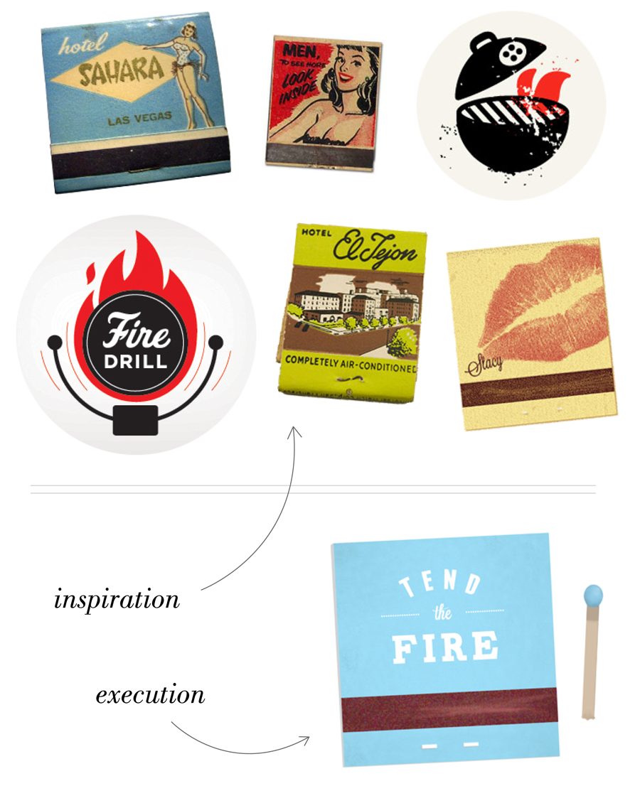
I'm working on a new project for BURNAWAY the online arts publication that I work for. They're are wanting to brand their membership campaign and I've been throwing some ideas around. Right now their membership page looks like this and I think that's a bit of overkill - not to mention eyekill. I liked the idea of using "burn" without actually showing flames, since flames are over done (I think). So taking some inspiration from vintage matchbooks, I came up with this little design draft. I know it still looks flat, but I'm not quite done. I have another idea in my back pocket, but I haven't pumped it out just yet. Do you like it so far?
photo cred: sahara // look inside // grill // drill // el tejon // stacy

No comments:
Post a Comment